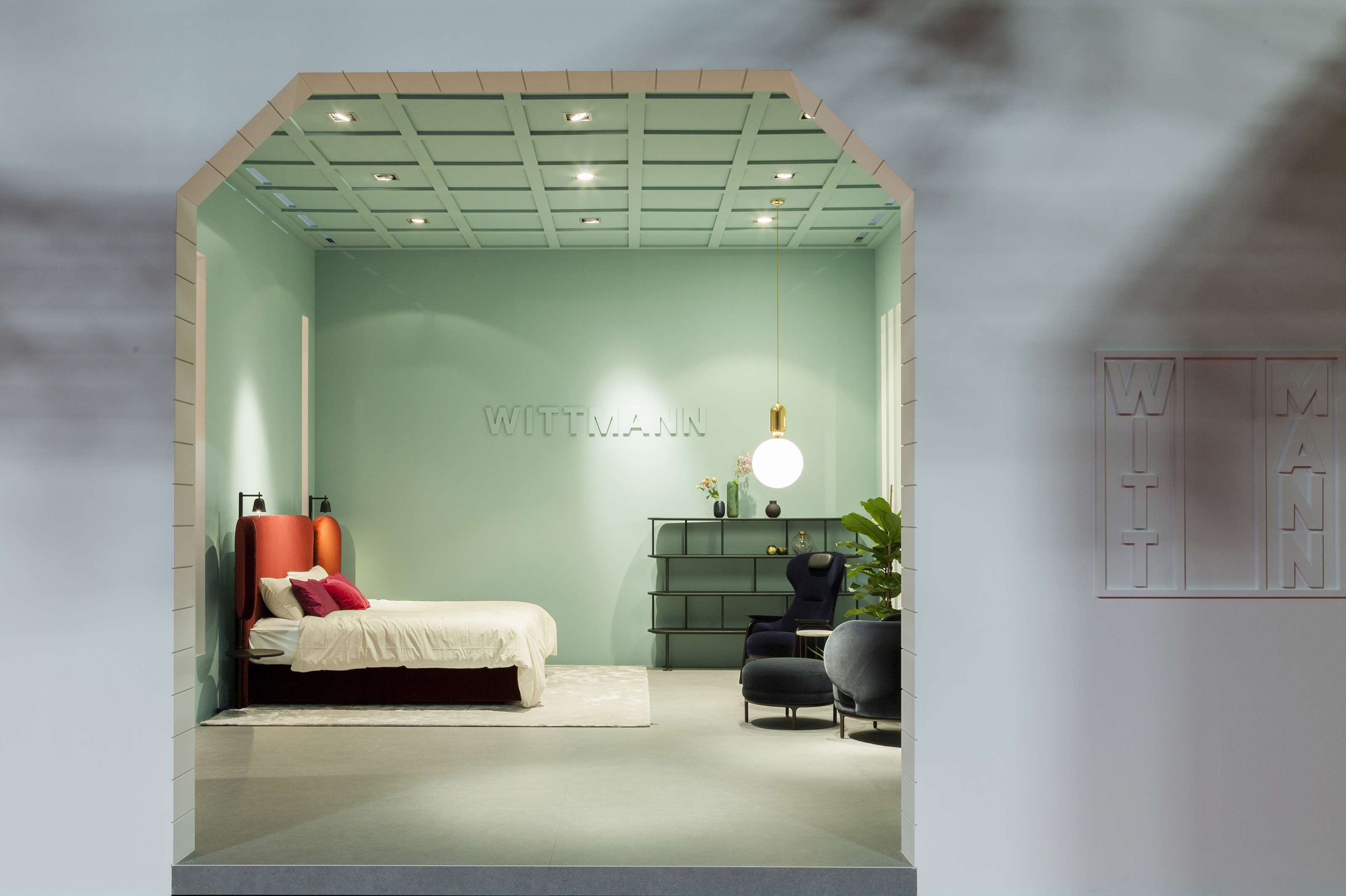
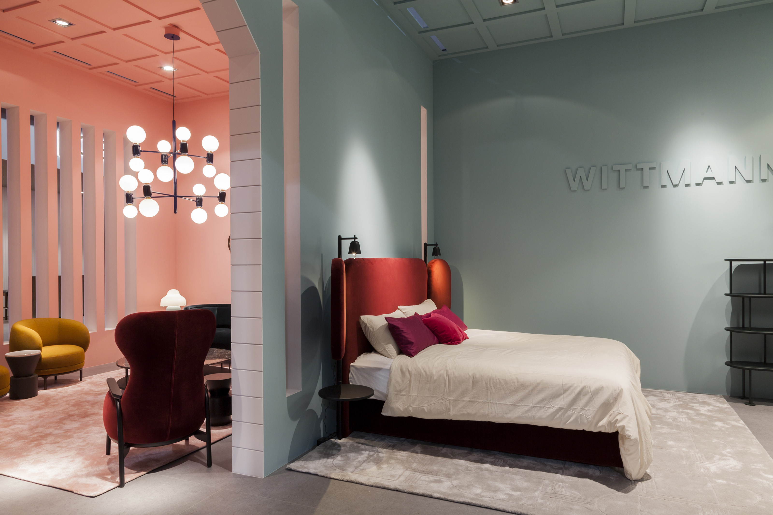
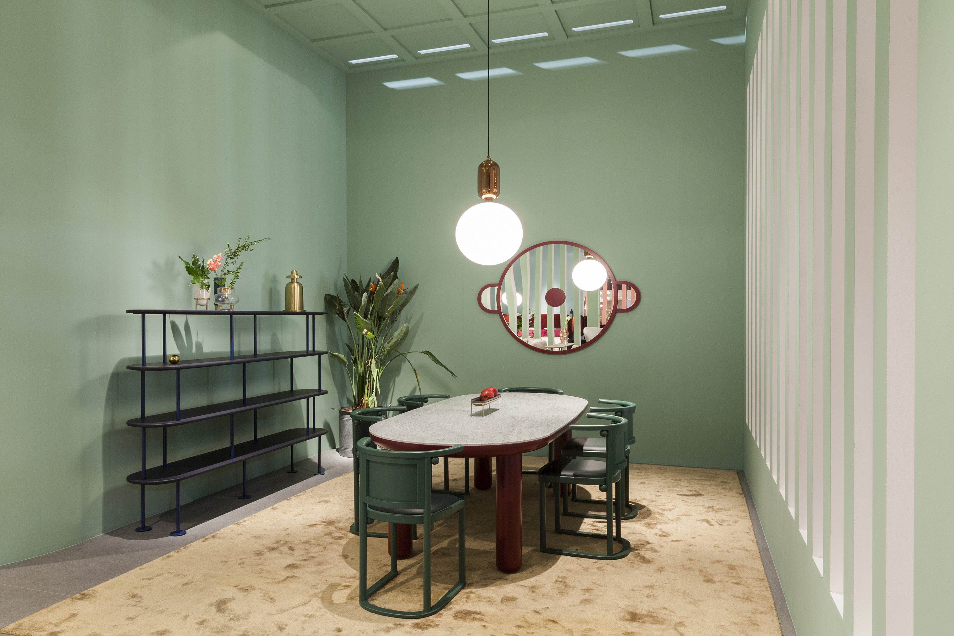
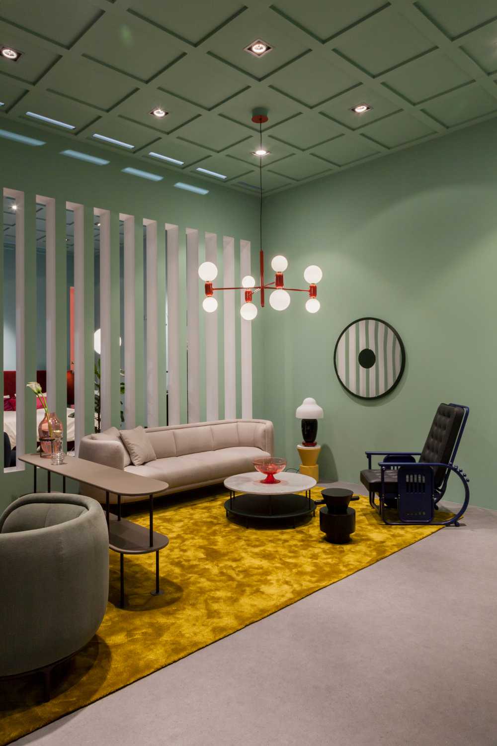
The aim of the project was to highlight the classic padded forms and the strong geometries of Wittmann, where their main feature is the study of the contrast between colours, fabrics and materials

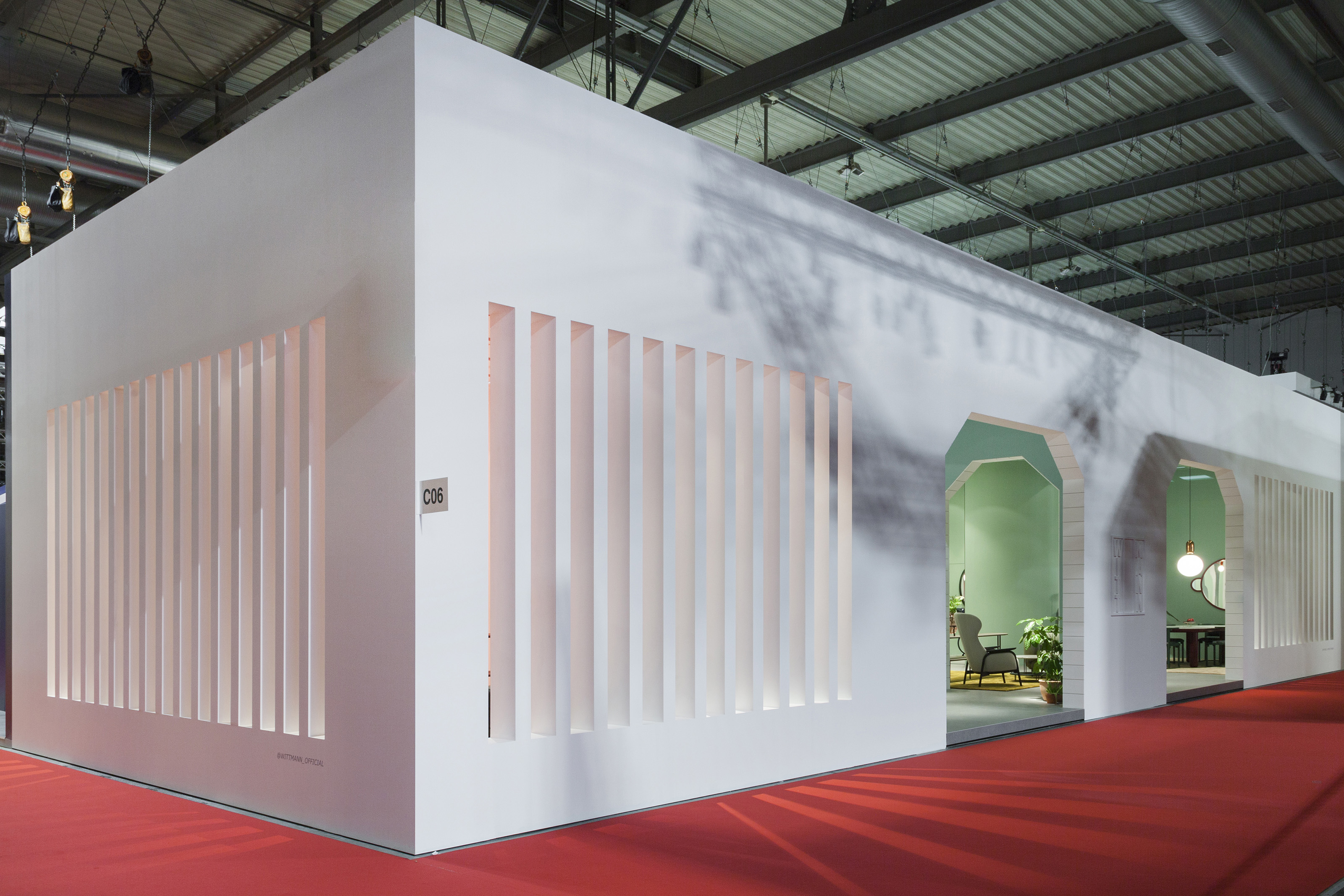
A stand for the Furniture Show. Contrasting pastel colours highlight the basic geometries
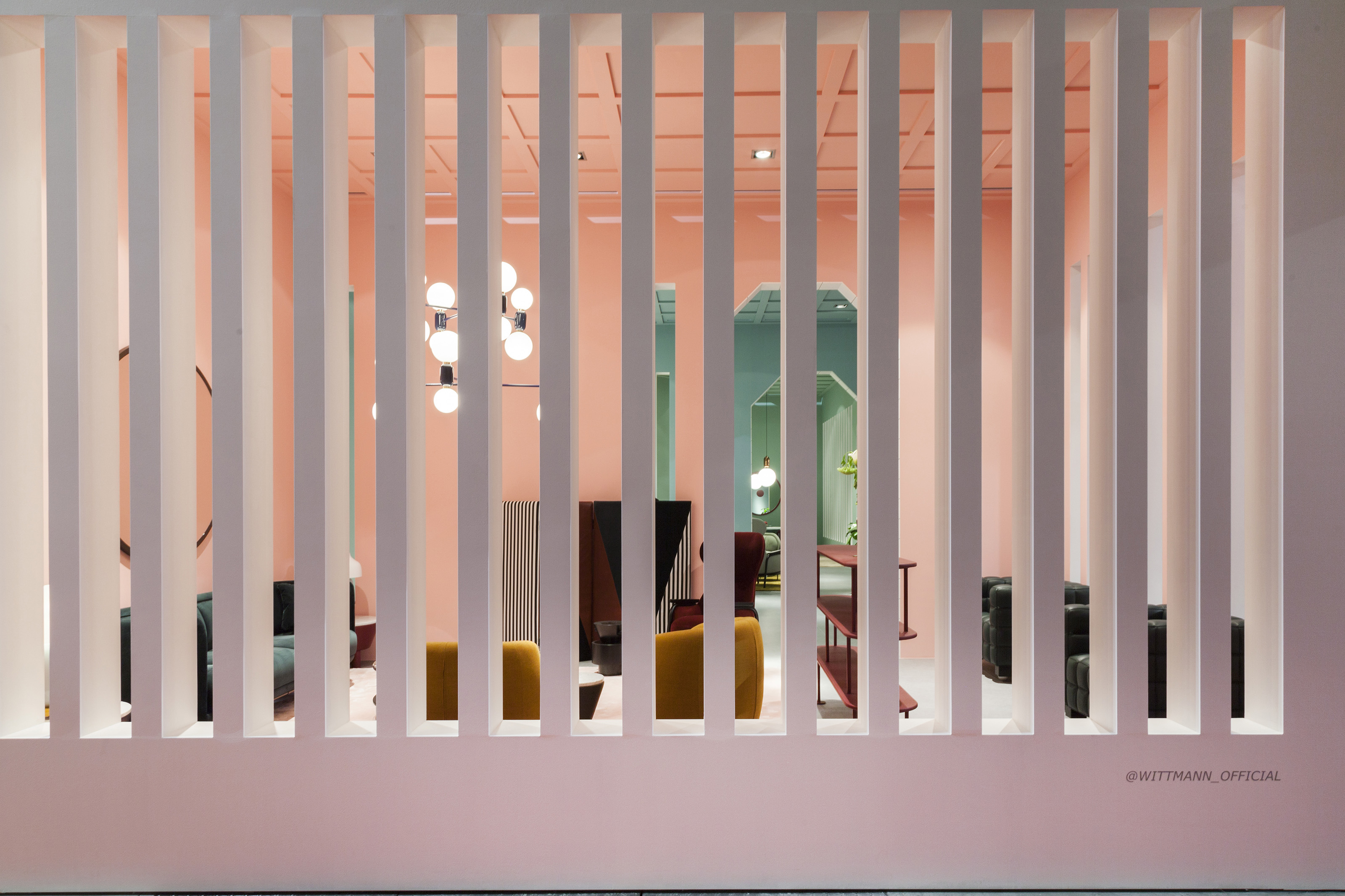
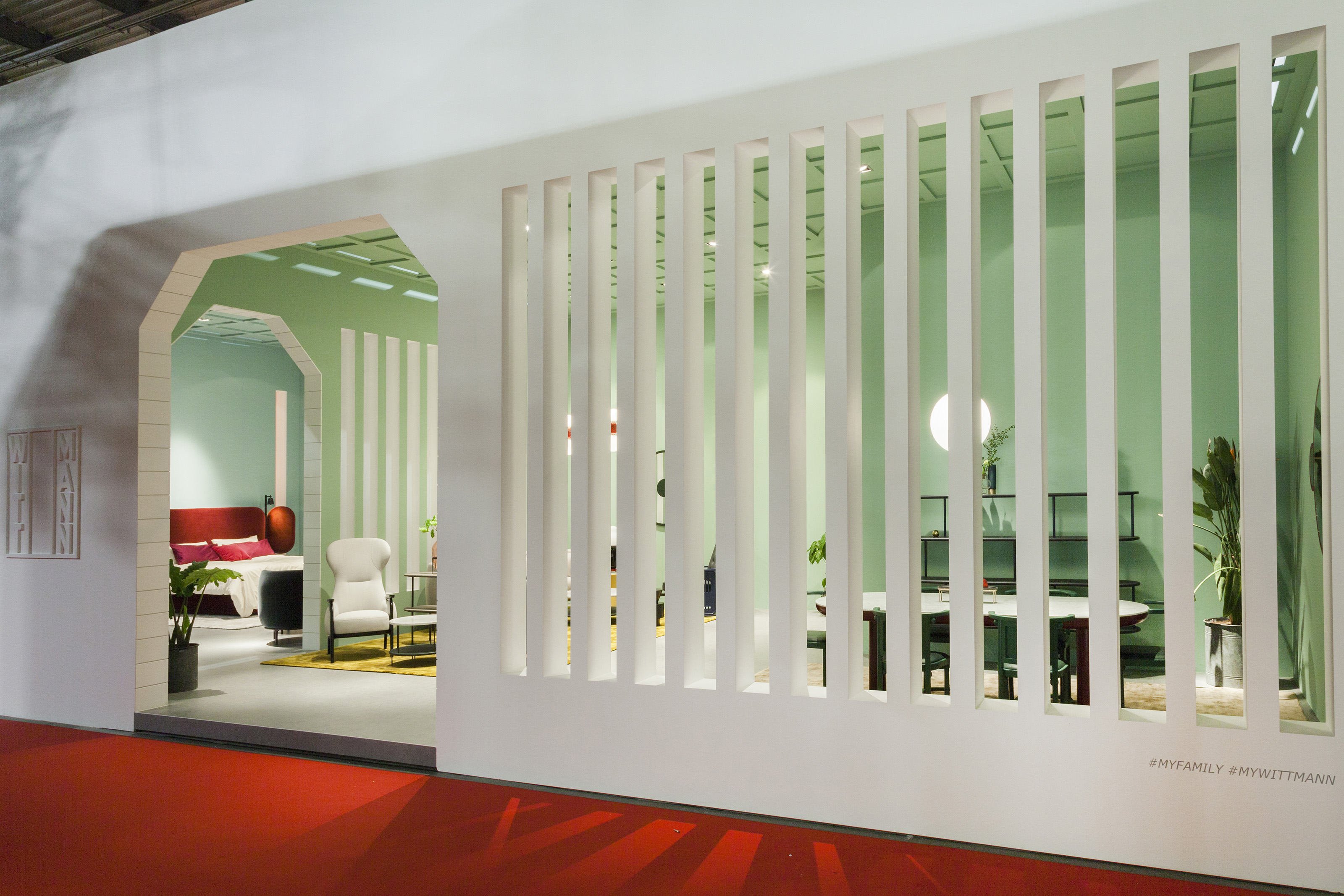
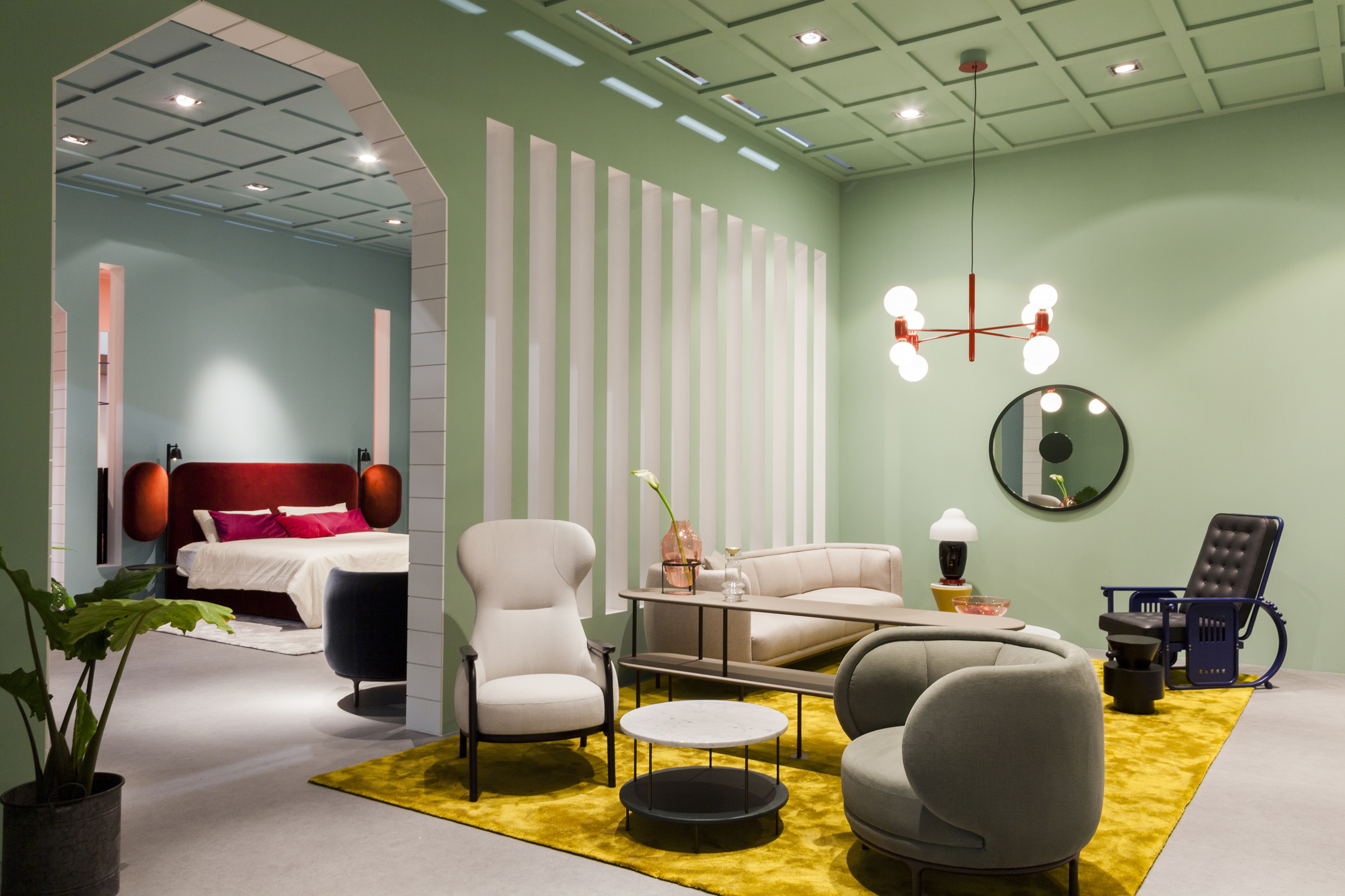
The Hayon Studio has designed the stand for Wittmann at the Milan Furniture Show, where the spaces are separated from the colour and are never closed thanks to the skillful play of vertical screens that never become full walls: the colour is the protagonist and art

The Hayon Studio has interpreted these patterns, in the artistic way that always contradistinguishes it, using full colours in contrast to the furnishings on display which are always complementary

The spaces are not separated, but flow into each other and the full walls are not present, they are replaced by repeated vertical openings: it is the colour that separates the spaces, as you change the setting you are welcomed by another colour scale
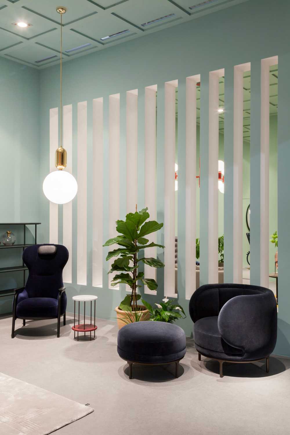
The division that does not exist horizontally and is not separated is instead highlighted in the panelled roof, which is also coloured, almost as if to create a limit and contain the colour, which would otherwise be dispersed around
Gallery