The History of the Fiat Brand: logo and identity evolution

The History of the Fiat Brand: logo and identity evolution

With the modernization of the production lines between the two World Wars, Fiat logo variations reflected the era's futuristic spirit. Logos were updated with vertical writings, emulating the futurist trends of the time. Interestingly, even after several transitions, the logo reverted to this graphic style in recent times, showcasing the enduring influence of Fiat brand identity evolution

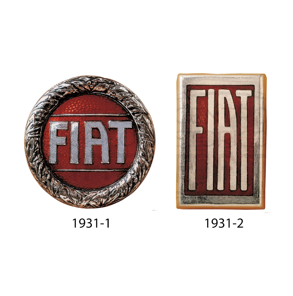
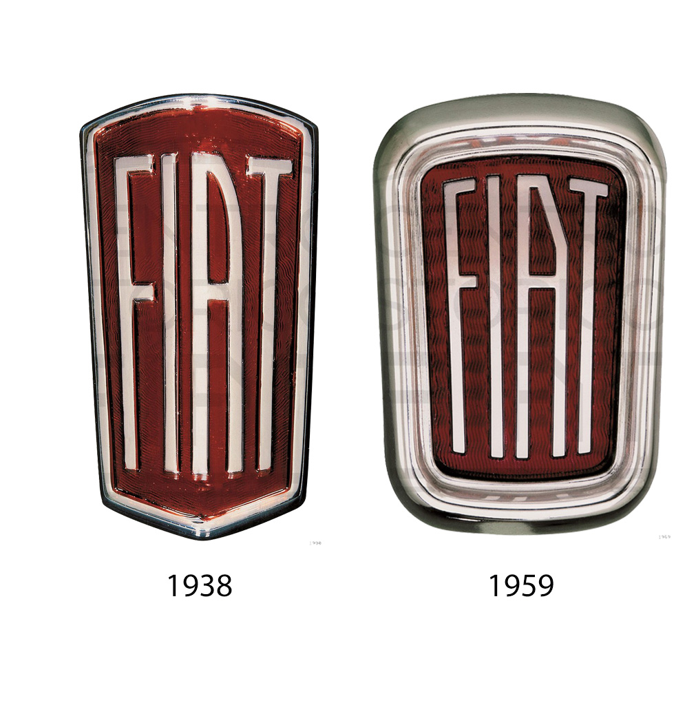
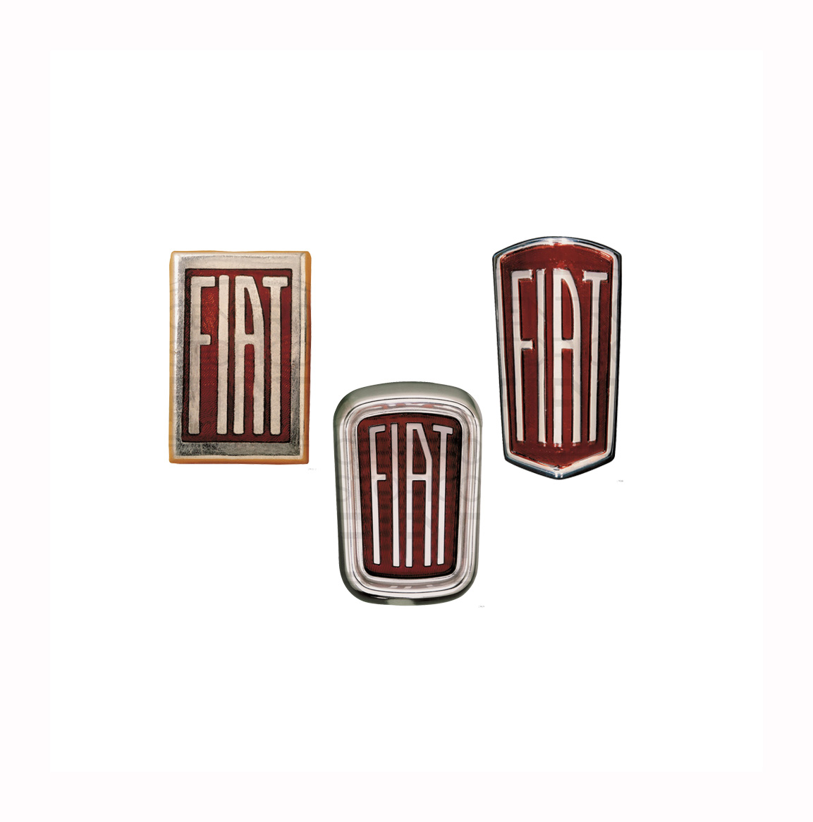
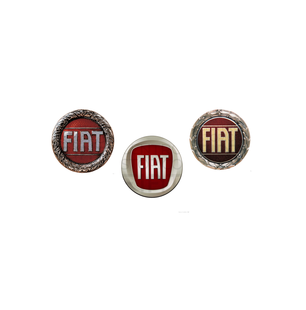
Fiat's logo evolution from round to rectangular: 1931-1934

Between 1931 and 1934, as part of the Fiat brand history, there was the appearance of a round logo with a red background and silver writing, used for the first time on the Fiat 515. In the 1930s, the radiator gave way to the grille, and it was in 1931 that the new rectangular mark was introduced, in line with a vertical enameled plate and the letters accentuated in their verticality. The symbol was adopted for the first time by the Fiat 524 and was influenced by the architecture of the time, which was distinguished by the regularity and precision of its forms

The History of the Fiat Brand: logo and identity evolution

Fiat 508 'Balilla': introducing the new logo

With the appearance of the Fiat 508 in 1932, better known as the "Balilla," one of the most popular cars produced by the company, there was also a significant change in the Fiat logo-a new shield with a slightly rounded shape at the edges that almost turned it into a trapezoid

The History of the Fiat Brand: logo and identity evolution

1938: Fiat's rounded transformation begins

In 1938, as the world approached the brink of a new war, the Fiat flagship embraced more rounded shapes, mirroring a shift in the brand's identity. Since 1938 and over a period of thirty years, the rectangular brand did not undergo any further changes. With the arrival of the Fiat 1800 and 2100, models with prestigious features, the logo was redesigned with larger dimensions and a more rounded contour

The History of the Fiat Brand: logo and identity evolution

Fiat's strategic business move and logo redesign

In 1965, the round brand with the laurel reestablished itself on the scene for a few years, but did not replace the rectangular one, which had become the official shield of the company. In 1968, the Turin-based company launched the complex business strategy that would give rise to the Fiat holding company. A new brand was needed to identify with this development, thus creating the brand with four rhombuses inclined at 18°, with the inscription Fiat in "univers" italic font, which became the company's logo, marking a significant milestone in Fiat emblem variations

The History of the Fiat Brand: logo and identity evolution

Fiat Panda unveils redesigned logo with four bars

In 1982, the four rhombuses appeared on the Panda's nose, together with a re-styled logo, which became the famous four bars. The two brands will coexist on the front of the car until 1991

The History of the Fiat Brand: logo and identity evolution

Gallery

0